About us pages are often overlooked by businesses, but this is a mistake. They are actually really important and one of the most visited pages of a website. Here are ten about us page examples to help inspire you.
Therefore, how you create your About Us page matters. It matters to your business and to your audience, so it’s in your best interest to make it shine.
However, it can be hard to come up with a winning design, especially if you lack inspiration or design skills.
But, a great About Us page isn’t so hard to accomplish, and by taking some ideas and inspo from other brands’ About Us pages, you can start to craft your own.
So let’s explore the reasons why an About Us page is so crucial and take a look at some of the best ones out there right now.
Table of Contents
10 Inspiring Examples of About Us Pages
So let’s get stuck into the list. Here are ten fantastic examples of About us pages for you to enjoy.
1. Chubbies
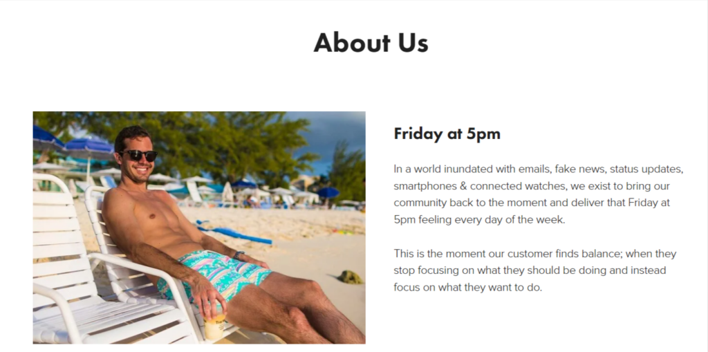
Chubbies is a company that makes and sells shorts for the average man. Disillusioned with the unrelatable male model’s sporting shorts that weren’t fit for purpose. Chubbies set about bringing shorts back to their original form and making them accessible to all.
The company was founded by a group of friends and focuses on “weekend wear,” comfortable, casual fashion that can be enjoyed by all men no matter what their shape is.
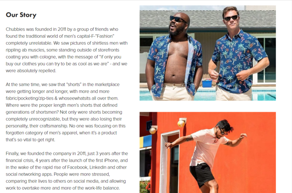
Chubbies’ About Us page is an excellent example of encapsulating the feeling and style of a brand in words. It’s friendly and approachable – just like its products.
The very first heading is “Friday at 5 pm,” which is a play on having that “Friday feeling,” and this is exactly what the brand conveys with its apparel.
The Our Story section explains exactly why the brand was established and who created it. It retains the same casual tone throughout the text and takes you on a mini journey of the company’s timeline.
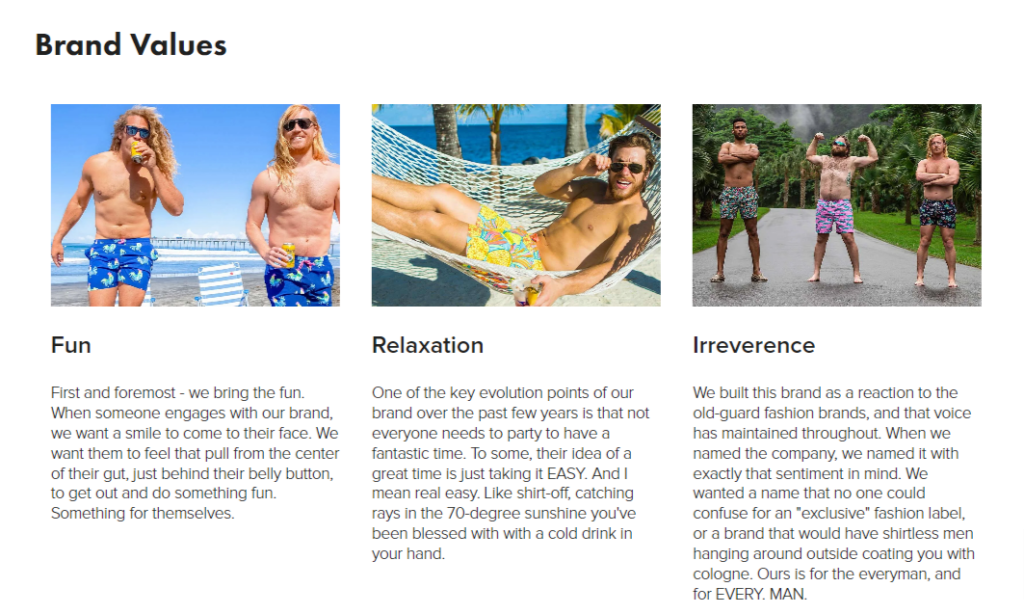
Finally, it breaks down the company’s values and who the brand is for. There’s absolutely no confusion about what Chubbies is and the type of person who shops with them.
The accompanying images are carefully chosen and totally capture the “Friday at 5 pm feeling,” and for the final touch, there is a fun team photo at the end to show the human faces behind the company.
If I had one (very minor) criticism, it would be that the text needs to be broken down into smaller paragraphs, but apart from that, it’s a stellar example of an About Us page.
2. Wild Fork
Wild Fork is a company dedicated to providing high-quality meat at an affordable price. The business is very proud to control every step of the supply chain – from farm to fork – there is a wide selection of meat to purchase.
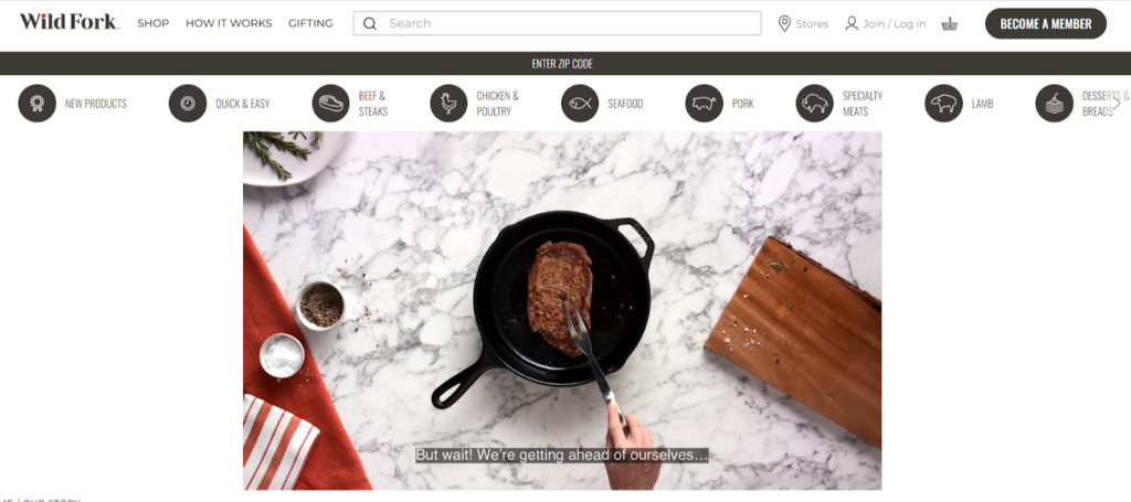
When browsing the Wild Fork About Us page, you are immediately presented with a video explaining what the company is and how it operates. Handily, there are subtitles included, so you don’t have to have the audio on to understand everything.
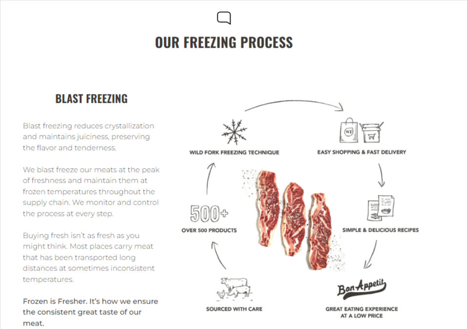
Then, as you scroll down the page, you notice the information is broken into handy sections such as quality, the freezing process, sustainability, etc. Each section contains a high-res image or GIF to accompany the information.
People are understandably very concerned about where their food comes from and how it is processed, and Wild fork does an excellent job of reassuring the customer that it is a quality and ethical product.
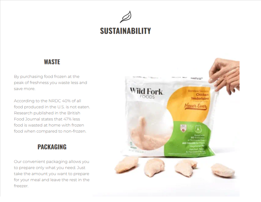
I particularly like the diagram images that explain at a glance the farm-to-fork and freezing processes. It removes the need to include heavy walls of text. Additionally, Wild Fork has gone to lengths to explain every aspect of its business, from the aging process of its meat to the type of packaging used.
When you get to the end of the page, you know precisely what type of product you’re buying and where it came from. However, the one thing missing from the page is the human element. There are no faces shown, which is a shame because this About Us page is otherwise perfect.
3. HubSpot
Hubspot is a software platform that allows its users to perform CRM, marketing, and sales all from a single dashboard. It has established itself as a market leader in this arena and is a very well-respected authority on a number of subjects thanks to the detailed reports and surveys it conducts.
The platform’s About Us page features everything you could ever want. Starting with its mission statement, you immediately understand that HubSpot is there to help your business grow.
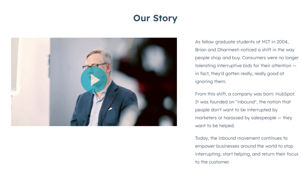
To build on that statement, you are then presented with a video that explains the company and its backstory in more detail.
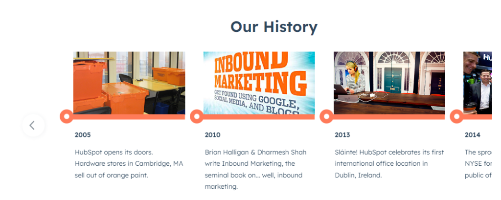
Then you get a cool interactive element that lets you click on and explore the company’s timeline. The image animations provide interest, and the brief overview under each year is concise, so the reader doesn’t get bored.
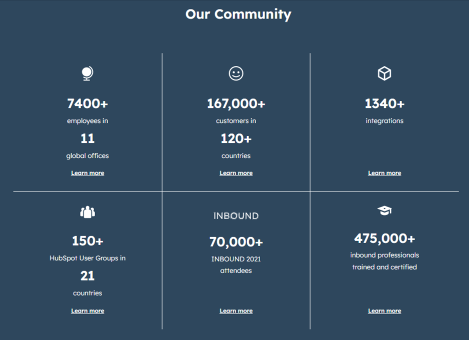
Further down the page is a platform overview divided into neat segments, and then you get a useful infographic showing the number of customers, among other metrics.
I feel this type of information is vital for service providers that otherwise don’t have a tangible product to display. Numbers speak volumes and provide social proof that the platform is used and valued by others.
Finally, the page ends with a quote from HubSpot’s CTO Dharmesh Shah; “Success is making those who believed in you look brilliant.” which is a neat and inspiring way to end the page.
Overall, this About Us page is a perfect example of adding exactly the right kind and amount of information in an engaging way, and I can’t find anything that needs improvement.
4. LoveBug
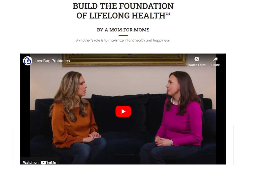
LoveBug creates probiotic products for great gut health for both children and adults. The company was born from a family’s ill health and the discovery that bad gut bacteria was the chief culprit.
The company is on a mission to spread awareness about how antibiotics have a detrimental effect on gut health and how probiotic products can restore the gut’s natural flora.
A non-medical company selling health products is tricky ground since it is difficult to build trust with its audience. However, LoveBug quickly establishes trust by having a clear message that it’s a company started by a mom for other moms.
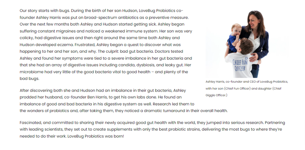
The YouTube video explains why the CEO started the company in the first place and does a good job of reassuring the audience that its products are credible. Then you have some text to back up the video, followed by valuable information about the brand’s products.
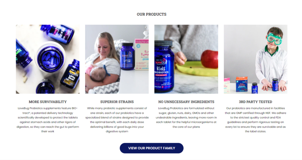
One thing that stands out about this About Us page is that it plays heavily into the human element. In fact, the page is almost entirely dependent on you resonating with the mom who started the business.
There are prominent images of the mom and her kids, and the video, of course, features the mom talking about her personal experiences with bad gut health. All of this feeds into the trust element, which is crucial for this type of product.
I feel this page could go into a little more detail regarding the science of the products. However, there is an extensive FAQ section at the bottom of the page that answers most burning questions and provides further reassurance.
5. Anton & Irene
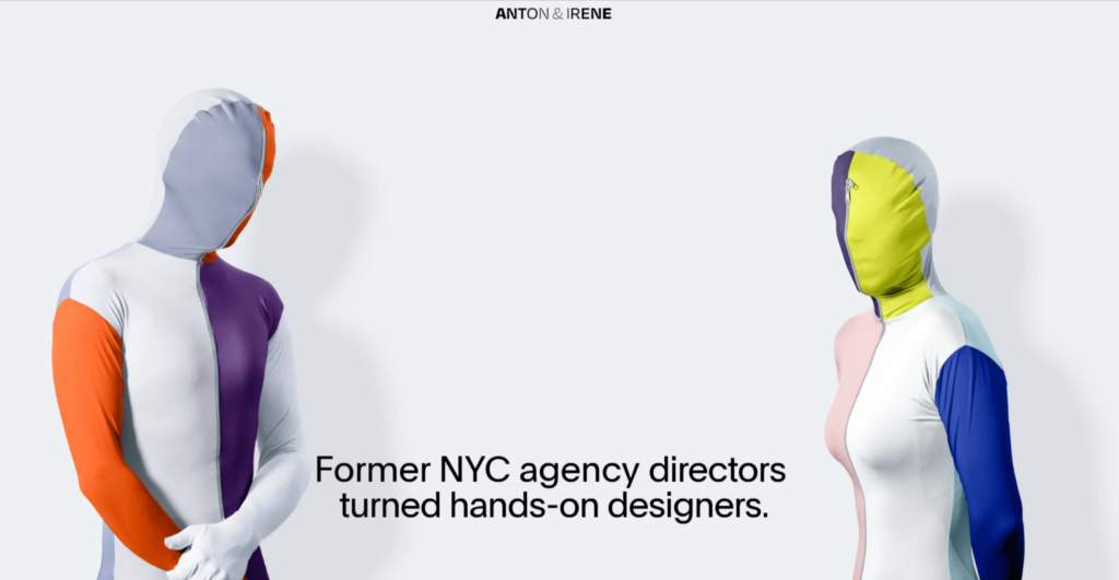
Anton and Irene are an NYC-based duo running a Brooklyn design agency. They have many high-profile clients and have won multiple awards for their work.
Anton and Irene isn’t a website, it’s an experience. Just take a look to see what I mean.
Their site takes parallax scrolling to new levels and provides a visual feast that smacks you in the face and provides an ultra-intriguing show.

I always marvel at how design agencies manage to get clients with a sub-standard website. After all, isn’t this the perfect opportunity to showcase your talents to potential customers?
Not Anton and Irene. Their entire website serves as an “About Us” page. It lets visuals do the talking, but as you scroll down the page, you get useful statistics such as the number of completed projects, awards gained, etc.
Then you get a long and impressive list of clients. Hovering over each client displays an image of their work which is a nice touch.
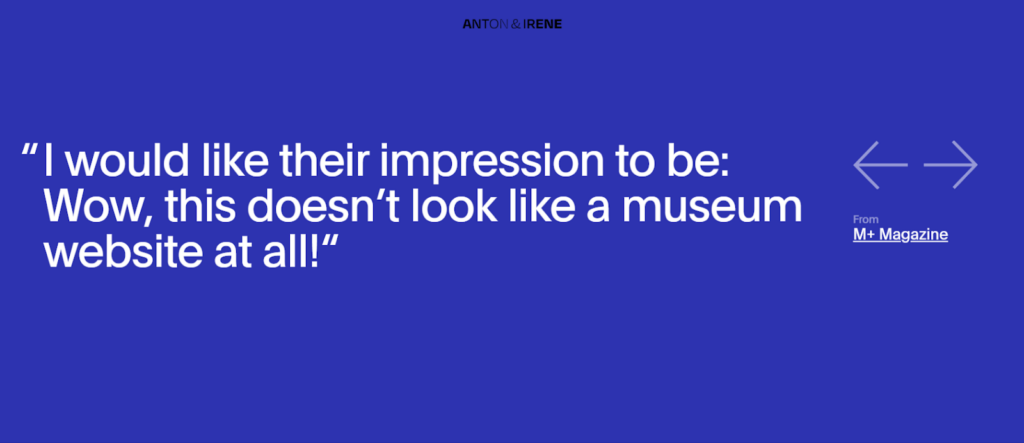
As you get further down the page, you are treated to more fancy parallax animations, some quotes from the press, and finally, a quote from each of the pair (you have to click on their images to get the quote to display.
I think this site knocks it out of the park in just about every aspect. It’s modern and exciting and covers all the essentials you’d expect to understand about a design business.
It may be a touch “avant-garde” for some, but that’s their style, and they showcase it exceptionally well.
6. Innocent Drinks
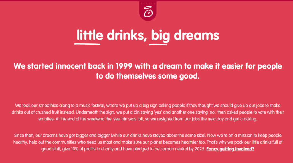
Innocent Smoothies is a UK-based business and has been around for over 20 years. They create pure fruit and vegetable smoothie drinks sold in major supermarkets in Europe. They were bought out by the Coca-Cola corporation a number of years about but still operate as an independent business.
I remember when Innocent Smoothies were first released, and I have been a fan of their brand ever since. When researching this article, I immediately thought of this company because they have always been known for their quirky and fun designs.
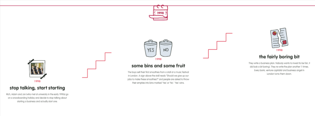
I was not disappointed. Innocent’s About Us page is stellar. It begins with the origin story (it began with fruit and garbage cans!) of the business and moves on to an interactive timeline where you can explore the company’s impressive history.
The accompanying illustrations and animations are cute, synonymous with the brand, and make the page light-hearted and engaging.
Rather than stuff the page with walls of text, you can click sections for the brand’s values, sustainability, and what it’s like to work for the company. The page creates an excellent balance between the human touch and company information without going over the top on either side.
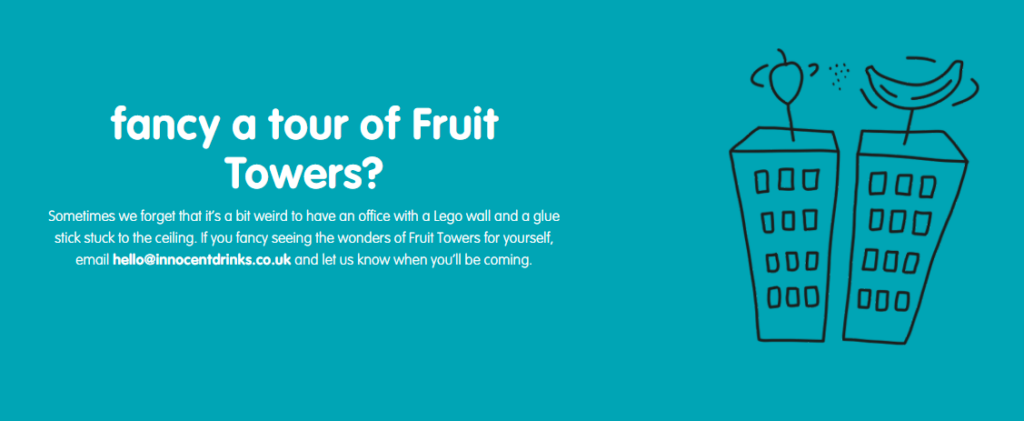
If you want facts and figures, yearly reports are waiting for you to click on them to view. Truly, this page provides an absolute tonne of information without overloading the About Us section itself. It’s there if you want to click on it, though.
One of my favorite things about Innocent is that they always maintained you could pop into their offices to have a look around whenever you fancied (and many people did). And they still maintain this today, although nowadays you must email first to arrange it.
This nice perk emulates the openness of the business and shows they have nothing to hide. “Innocent,” so to speak!
7. Trusted Housesitters
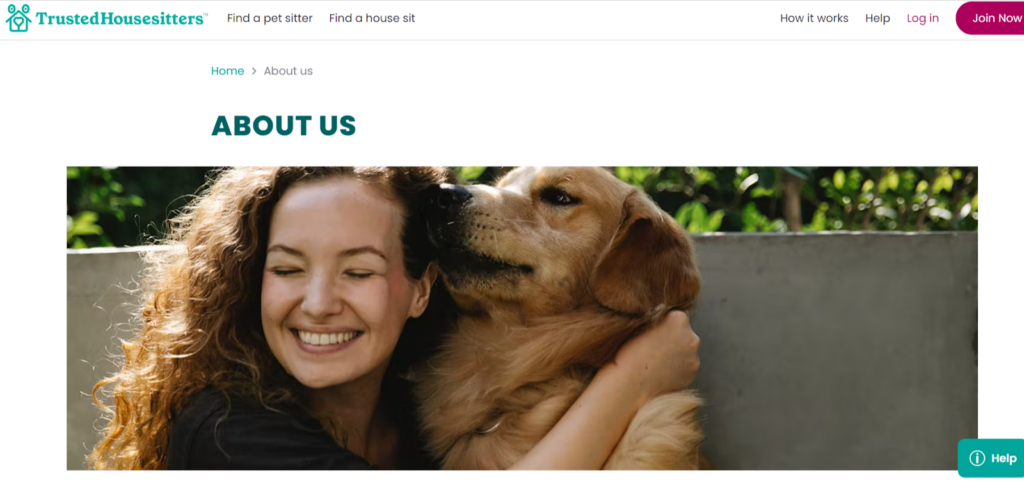
Trusted housesitters is a site that brings pet lovers together and connects pet owners with housesitters. It’s a globally renowned site and operates on an exchange basis. Pet owners get free pet care, and housesitters get to stay in their homes for free.
People pay a fee to use the site, and it’s built upon verified users and reviews.
The site’s About Us page is concise and incredibly readable. It uses a nice, clean font making it accessible to most.
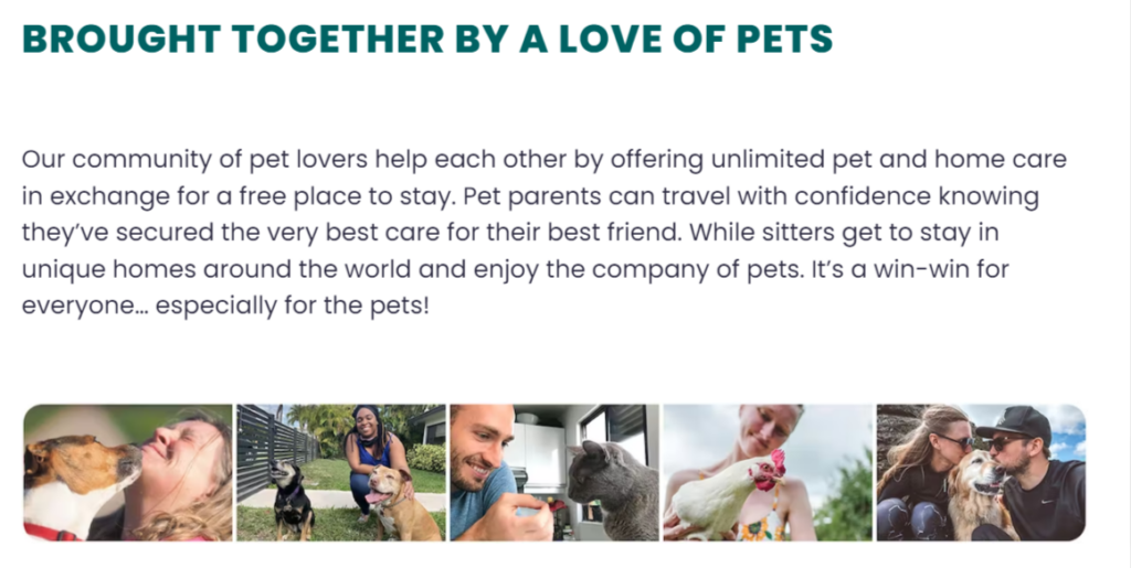
What’s interesting here is that the page does not rely on fancy animations or interactions to make it stand out. Instead, it focuses on statistics and plenty of customer images accompanied by positive testimonials.
You also have a quick “where it all began” section, explaining why the business was started, along with a photo of the company founder and his dog.
Overall, the human element is strong on this page. After all, a site that specializes in connecting people with other people should be able to demonstrate this easily, and that’s exactly what Trusted Housesitters does here.
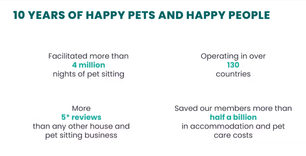
Finally, there are a few clear statistics for the numbers people to enjoy, and to finish the page, there’s an endorsement from a famous vet.
Overall, a beautifully clean and exceptionally clear example of an About Us page.
8. Just Eat
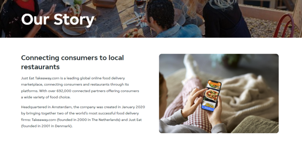
Just Eat is a global online food ordering and delivery service that originated in Denmark over 20 years ago. It’s now headquartered in Amsterdam and connects almost 700,000 eateries with hungry customers.
Just Eat’s About Us page proves that you don’t have to be fancy with your design; you just need to have things clearly laid out.
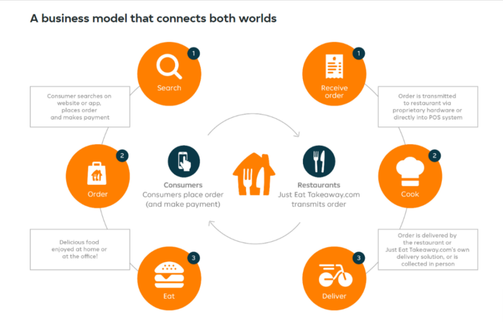
While the page does start off with a couple of text blocks explaining the origins of the company and the benefits of using the service, it quickly moves on to a simple yet informative diagram that shows exactly how the business operates.
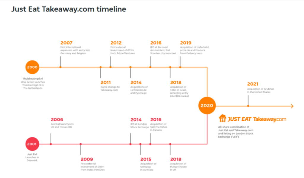
Next, you have a thoughtfully displayed timeline that doesn’t overload with detail but very concisely explains the company’s history. You also have some text around this for those interested in learning more.
I will say this page is definitely lacking the human element. However, this is unfortunately typical for global brands that no longer have a company “face.” Despite this, it’s still a great example of “less is more.”
9. Moz
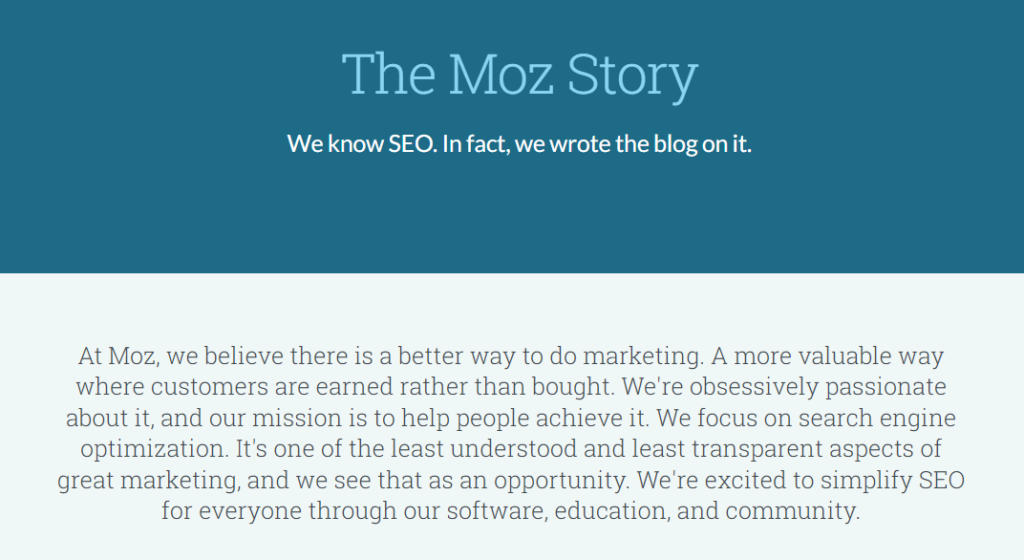
Moz is a business that specializes in providing SEO services to businesses around the world. It offers a SaaS platform of SEO tools businesses can purchase and use on a tiered-priced basis.
Moz is definitely at the more serious end of the spectrum, and this is reflected in its About Us page. However, it still manages to maintain a human element through the use of its images and manages well not to stray into that overly corporate territory.
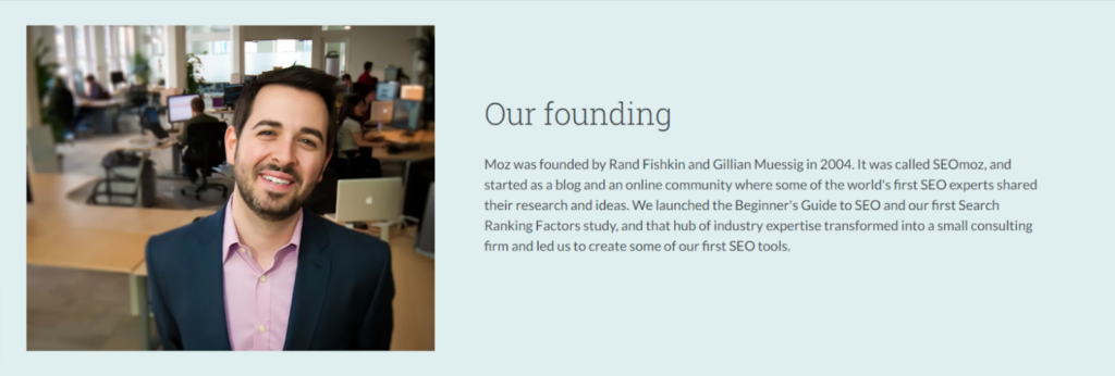
The page is simple, with well-structured text blocks that explain the company, its founder, and how it got to where it is today. The page is completely static, with no elaborate animations or interactions whatsoever.

Scrolling down the page, the information flows well. When you come to the end, you have a good understanding of what the company is about. It’s to the point while still maintaining a friendly tone.
Moz proves that you don’t need to go crazy with your About Us page. A simple and minimal design with appropriate images will work perfectly well and can be just as effective.
10. Neal’s Yard
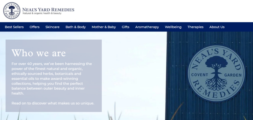
Finally, we have Neal’s Yard, a holistic and organic beauty product manufacturer based in the UK. The company only uses natural, ethically sourced, and sustainable ingredients in its products and has very strong values.
The company’s About Us page contains a lot of information. However, you have to click on one of the gorgeous images to access it. And while there is a lot of information, it’s neatly segmented and simple to follow.
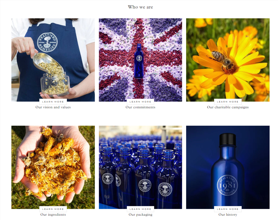
I love the cohesive imagery here. Clicking on one brings up even more beautiful and perfectly on-brand images, and each page is nicely animated to create an engaging experience.
And you have everything you could ever want to know. From the founder’s story (including their photos) to detailing the company ethos, values, and more. When you’re done, you have all the information to make an informed choice about whether this company is for you or not.
Something that’s really important where beauty products are concerned.
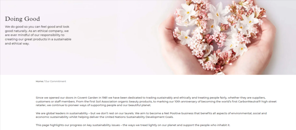
To finish off the About Us page, Neal’s Yard proudly displays its awards and certification badges, further enhancing its trust factor and reassuring the reader that it’s a renowned and reliable brand to purchase from.
This is a super elegant About Us page that conveys a lot of information without becoming boring.
What is an About Us Page?
An About Us page is used by most businesses on their websites to explain what the company is and how it operates.
The page typically comes with a backstory of how the business was established, who founded it, and what has happened since then. Often, the About Us page includes information about how the products are made, who the suppliers are (if there are any), plus details about the company ethos.
You may also find the company’s current and future goals outlined on the page.
Why an About Us Page Matters

About Us pages matter for several reasons. First and foremost, it’s there to inform the reader about the business and how it operates. While this is a straightforward enough reason, it goes deeper than that.
About Us pages build trust and credibility. If the reader can see exactly what the business is about, its practices, and the faces behind it, they will be more inclined to use the company rather than one that lacks this information.
Furthermore, About Us pages allow consumers to choose brands that reflect their ethos. For example, many consumers are now interested in the sustainability or ethical practices of businesses, and if this information isn’t available, the customer will simply move on to a different brand that is transparent about its practices.
Lastly, an About Us page is crucial for search engines and provides an additional way for a business’s website to be found in SERP results.
What Should a Great About Us Page Include?
New visitors are more likely to visit your About Us page than any other page on your website besides the homepage, so it has to be good; otherwise, any potential customers will leave right away.
Here’s what a winning About Us page should include:
- Your brand story: What sparked the idea for the business? When and how was the business established? How has it grown?
- The human element: People don’t like faceless corporations, so add information about the company founders. Make it friendly and approachable.
- Share success: Metrics such as number of customers, number of employees, etc., are all perfect for an about page
- The brand ethos: How is your brand making the world a better place? And what are the principles and values upon which your company is based?
- The future: What direction is your brand heading in? What are its hopes and aspirations for the future?
It’s not just about the information either; a great About Us page will also be formatted in an eye-catching and inspiring manner:
- Add relevant images. Show your business and its employees in action. Include the faces behind the business
- Write in the first person and directly address the reader
- Use design elements such as infographics for data-based information (use Canva Pro to create them)
- Break the information up with sub-headings
- Include quotes or testimonials where appropriate
- Use clean, readable fonts. That fancy script font may look lovely, but if no one can read it, what’s the point?
- Optimize it for accessibility. Anyone should be able to read your page, no matter their ability
- Include links to your most popular blog post pages
Summary – Inspiring About Us Page Examples
I think it’s clear that About Us pages don’t necessarily have to be elaborate or include complex animations or interactions to be interesting. I’ve shown you a wide range of pages, from the crazy avant-garde to the simple and concise.
All are excellent in their own way, but most importantly, all perfectly encapsulate the brand they’re describing. And this is the most important takeaway from this article. From the language style you use to the images you post, make sure it represents your brand 100%.
If you’d like to get motivated from browsing through design solutions for other page categories, read my articles on:
