If you have read my Shopify review then you know that it’s the best easiest way to start an online store. Their platform is trusted by millions of businesses around the world. Although starting is easy, growing your online business can be difficult if you don’t know where to start. In that case, it’s always a great idea to see what other successful businesses are doing.
Here I will show you some of the best examples of Contact Us pages and About Us pages for online stores. I will also show you why they work and what you can learn from them.
Why Your Contact Us Page Is Important
If you want to run a successful business, you need to keep your costs low.
Do you know one of the biggest costs of running an online business? Customer support.
Your contact us page shouldn’t simply list a couple of ways to contact you. It should solve people’s problems or at least put them in the right direction. A good contact page can reduce your customer support requests and help you help your customers faster.
Why Your About Page Is One of The Most Important Pages on Your Website
Your website’s about page plays an important role in building trust with your customers. If your customers don’t know who they are buying from, they will have a hard time trusting you.
We have all come across those websites that have basic corporate jargon on their about page about when they started and what they do. That tells you nothing about the people behind the business. And in some cases, it can make you feel as if the website’s owners are doing something shady and trying to hide their identity.
Another reason why you should spend some time creating a good about page is that good about page is your chance to differentiate yourself from everyone else on the internet. Putting a face or a couple of faces to your brand differentiates you from all the other big-name faceless companies in your industry.
Top 5 Shopify Contact Us Page Examples
Here are some of the best Shopify Contact Form and the best Contact Us pages examples:
Yeti
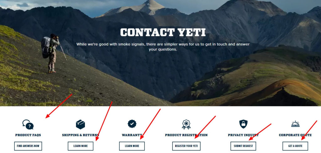
Unlike most websites that offer a basic contact form, Yeti’s contact page gives you multiple options to choose from based on what you need help with. To reduce the number of support requests they have to deal with, they link to their shipping policy and warranty right from their contact page.
They also offer their contact info if you scroll down in case you can’t find what you are looking for:
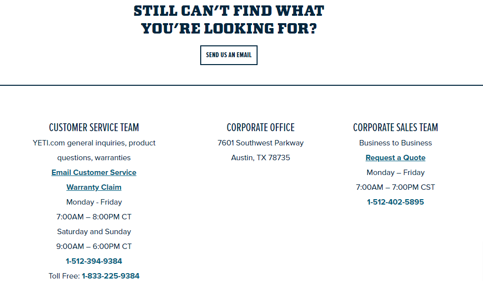
A contact page that directs customers to different departments or help pages can reduce customer support requests. It also sends the customers directly to the right support representatives.
MeUndies

MeUndies’ contact page is a full-blown help center with answers to almost anything that their customers might ask about. Most people don’t want to wait on a call to talk to a customer service representative. If you can provide the answers to their questions on your website, it can reduce the number of support requests you get.
MeUndies answers almost all their customers most common questions on their Help Center pages:
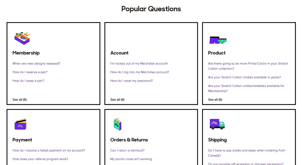
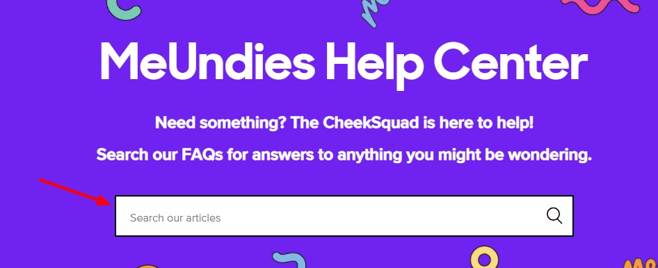
If a customer can’t find their query in the popular questions section, they can use the search bar at the top of the page:
… or they can reach out to MeUndies support from the bottom of the page:
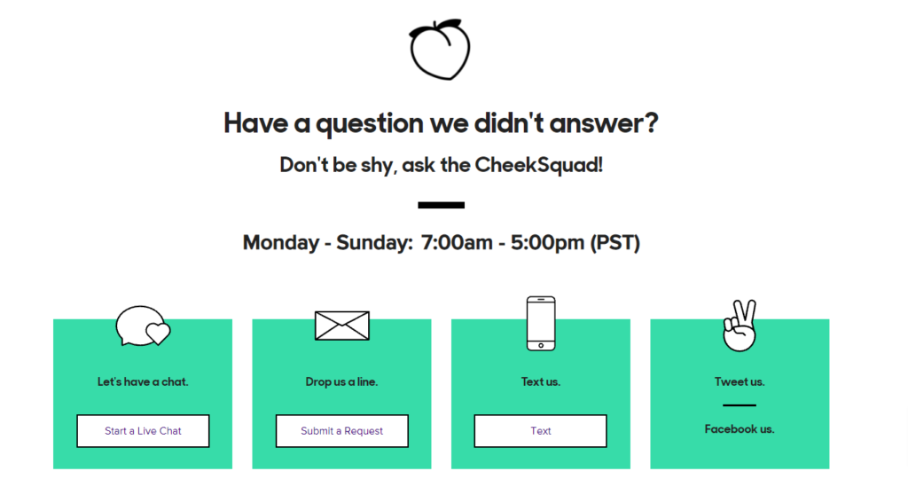
Dollar Shave Club
Dollar Shave Club’s contact page is a minimal form that simply asks the customer what they are looking for help with:
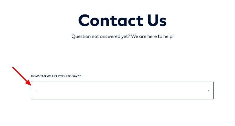
It’s a drop-down menu that lists popular queries:
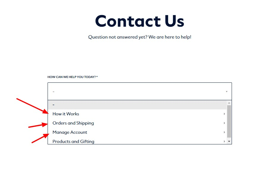
What makes this contact page great is that rather than directly connecting you to a customer support rep for these queries, it first offers an answer:
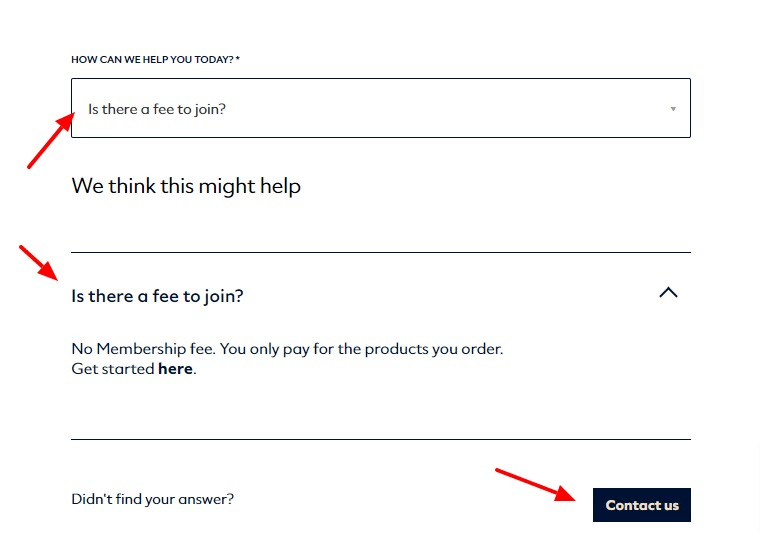
And if your query isn’t answered by the FAQ, then you can contact customer support.
Dollar Shave Club tries to answer the most common queries customers have directly on the contact page to save support requests.
Moonpie
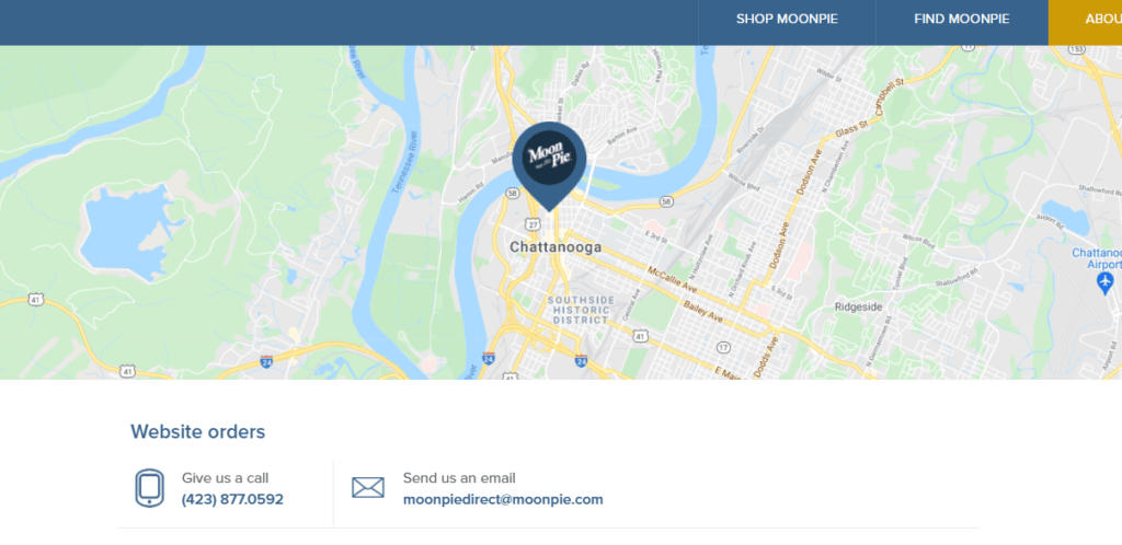
Moonpie’s contact page displays their bakery location right at the top. So, any customers who might first want to see what they are buying can visit their physical location.
If you have a physical office or a brick-and-mortar shop for your brand, be sure to put a Google map on your contact page to let people know where it is.
Poo Pourie
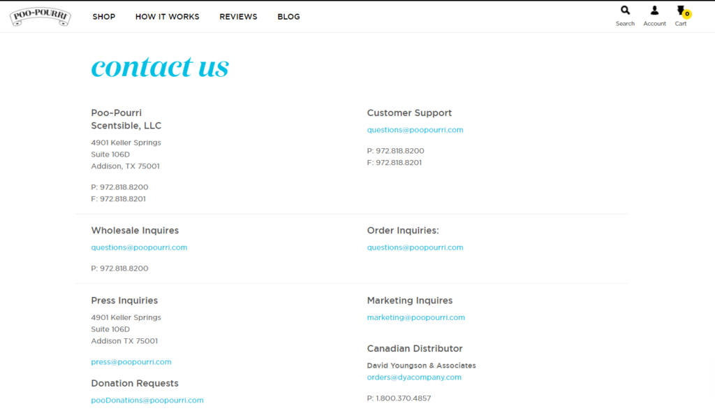
The reason why I like Poo Pourie’s contact page is that it’s so simple. Rather than offer a contact form, they simply give you their contact details for every department from customer support to marketing.
Having department-specific contact information can help reduce the number of customer support requests that need to be redirected.
Top 5 Shopify About Us Page Examples
The “About Us” page on Shopify is an essential component for any online store. It serves as an opportunity for businesses to establish their brand identity and build trust with potential customers. About Us page Shopify offers probably the best eCommerce About Us pages.
Kelty
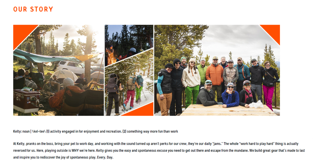
Kelty’s about page doesn’t read like your usual corporate jargon about page. It reads like it’s written by a real human being.
Their About page gives you an idea of the type of culture they have at their company:

They also list their company values on their about page to let you know what they believe in:
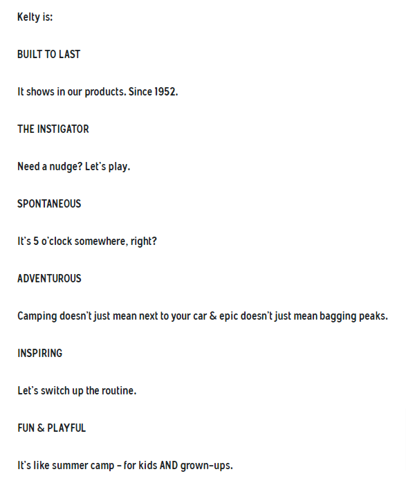
A good about page has personality. If you want your about page to stand out in a sea of sameness, then you need to make sure it has a personality.
Kelty also shows the fun side of their team:

Showing that your team is relatable and human on your about page goes a long way. If you don’t have any pictures of your team on your about page, you should add some. It will make you look more human and trustworthy:

Larq
The best part about Larq’s about page is that it puts a face to the brand right at the top of the page:

The main job of a good about page is to build trust. If you scroll down Larq’s about page, they link to their page about their technology:
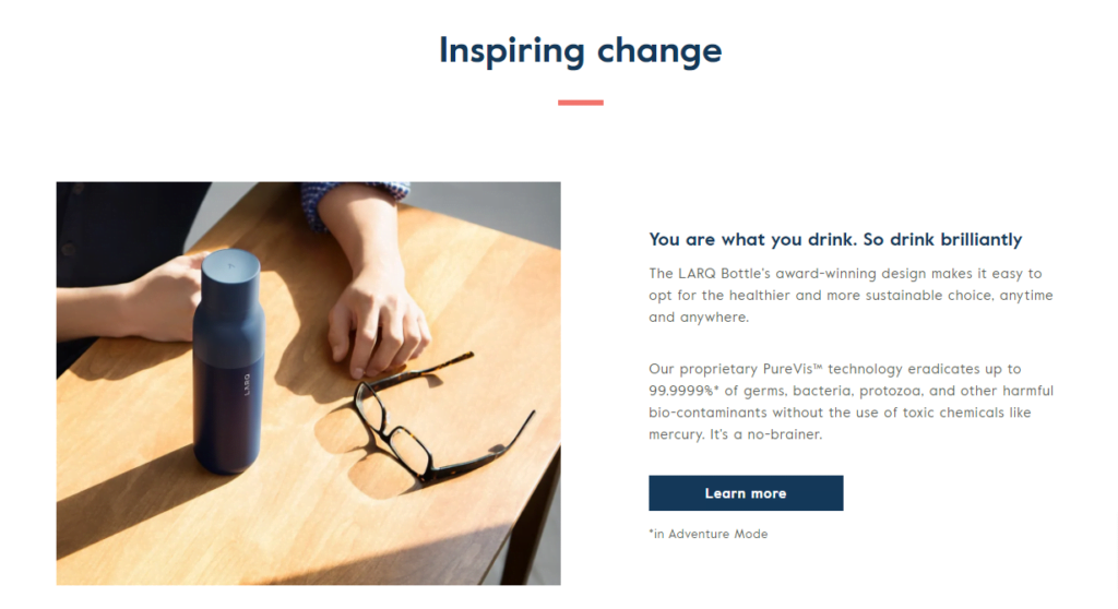
Their technology page lists the science behind their products:
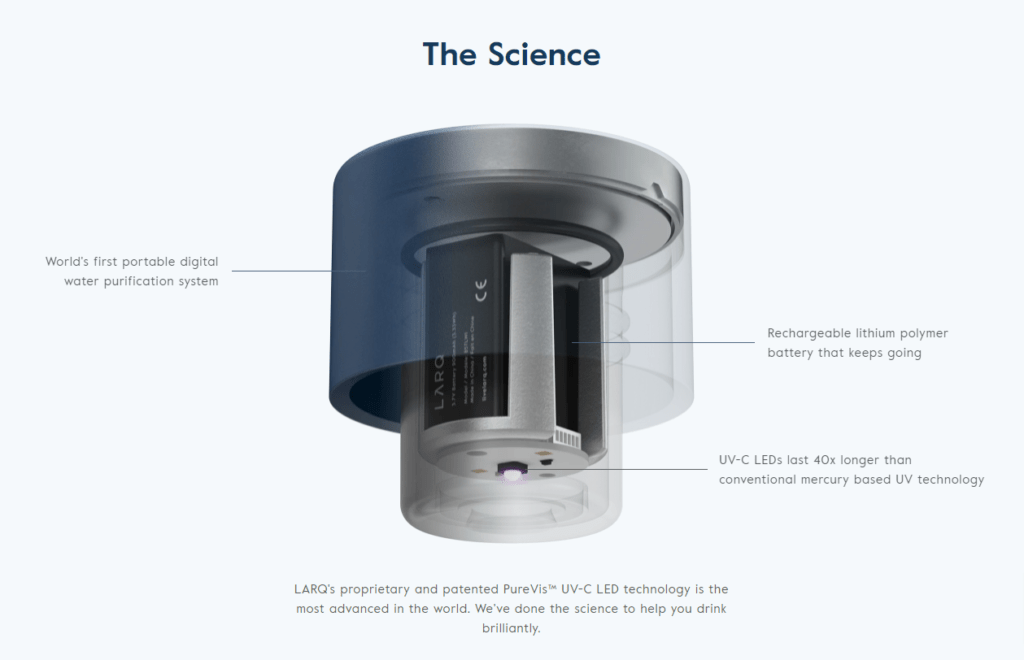
They use their about page to build trust with their customers.
Tattly
Tattly’s about page tells the story of how the product came to be and puts a face behind the brand:
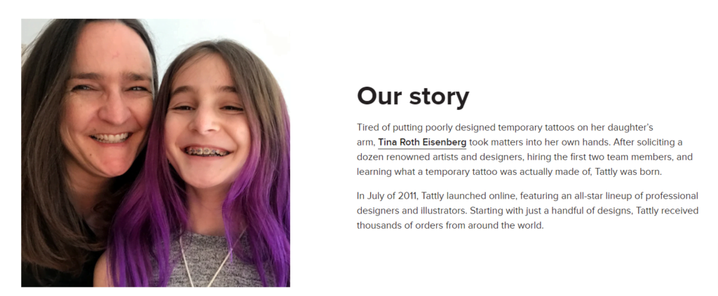
Telling a story about your company and your brand on your about page is the fastest way to build trust with your customers. It tells your customers you’re more than just a faceless corporate brand. It helps you stand out.
Tattly also does a good job showing their product in use right at the top of the page:
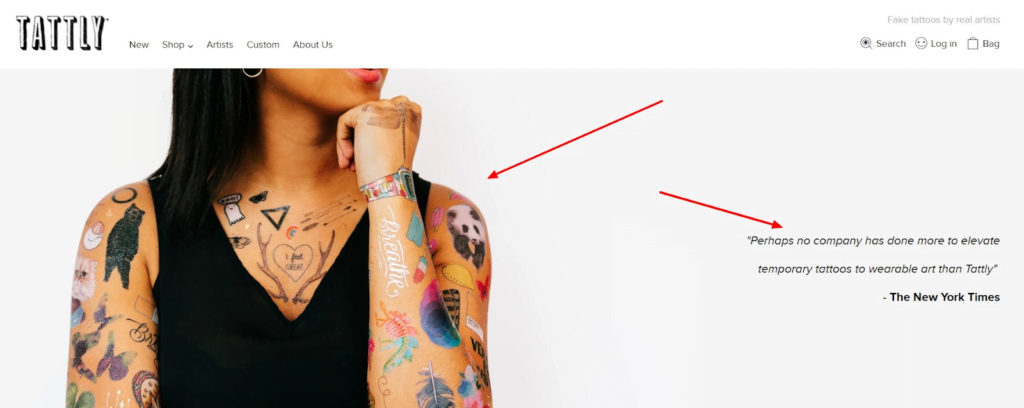
It also tells you what the media thinks about their product.
Tattly’s about page also lists some of their team members:

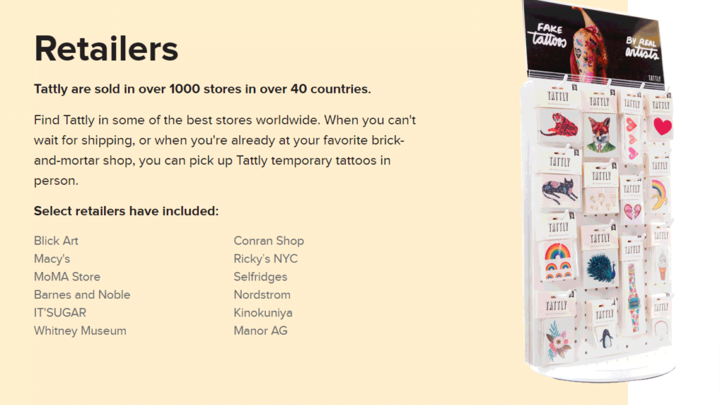
And best of all it tells you where you can grab the product:
Bliss
Bliss uses their about page to build trust with their customers by answering their most important questions about the product:

Their customers care about veganism and animal rights, so they talk about how their products are cruelty-free and vegan.
They also know that their customers don’t like chemical-based skin care products, so they talk about how all Bliss products don’t have any of the bad chemicals that might harm your skin:
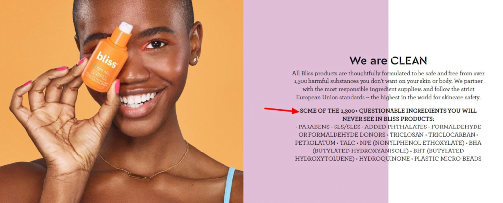
It helps them differentiate themselves from the big brands that definitely use these many of these listed ingredients.
Your about page is your chance to differentiate your business from the big brands in your niche. Is there something that you do differently than other businesses in your niche? Is your process different from other businesses? Are your products chemical-free? Talk about it on your about page.
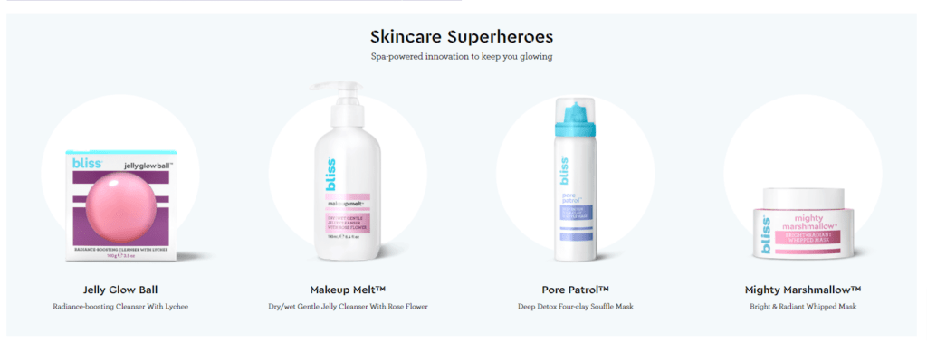
Another thing we can learn from Bliss’ about page is how it lists some of the company’s most popular products at the bottom:
Bulletproof
Bulletproof Coffee’s about page aims to differentiate the brand from everyone else in their industry. They do this by talking about what makes their brand and their products different:
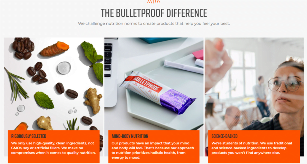
They know that their customers are fitness freaks and don’t like Soy, Gluten, and GMOs. So, they talk about it how their products don’t have any of these ingredients:

It’s how they let their customers know that they care about their needs.
They also talk about Dave Asprey, the founder of Bulletproof Coffee, briefly on their about page to put a face behind the brand:

One of the things we can all learn from their about page is that they link to their best and most important content everywhere on the page:

Their ‘our story’ section links to their bulletproof coffee recipe page, which if you know the brand, is the most important page of their website.
They also have a getting started section at the bottom of the page that links to the pages that they know will get people to try their products:

Wrap Up
After reviewing dozens of successful Shopify stores and templates, I’ve seen firsthand how well-crafted About and Contact pages can transform an online business. If your Shopify site lacks these crucial elements, now’s the time to act.
Creating an effective About page isn’t just about listing facts – it’s about telling your unique story. When I revamped my own store’s About page to include team photos and personal anecdotes, our conversion rate jumped by 15%. Customers repeatedly mentioned feeling more connected to our brand after reading about the people behind it.
As for Contact pages, they’re not just for fielding inquiries. A strategic Contact page can significantly reduce your support workload. By implementing a comprehensive FAQ section and clear contact guidelines on one of my stores, we cut support emails by 30% in just one month.
Remember, these pages are powerful tools for building trust and efficiency. Take inspiration from the examples we’ve discussed, but make sure to infuse your own brand’s personality. A compelling About page and a well-structured Contact page will not only streamline your customer support but also foster lasting connections with your audience.
Don’t wait – start working on these crucial pages today. Your future customers (and your support team) will thank you.
